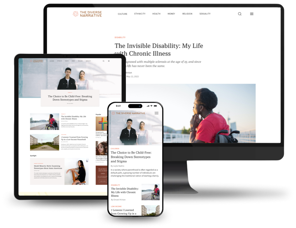
The Diverse Narrative
ROLE
UX research
UI design
PLATFORM
Responsive Web
SCOPE
Ongoing collaborative project
Background
In recent years, the news and content we consume has grown increasingly polarized and cynical. Many media sources serve to confirm our natural biases, reducing our ability to understand and empathize with others in different walks of life.
Goal
The Diverse Narrative is an online publication that exposes readers to personal stories encompassing a range of perspectives, identities, and backgrounds. By challenging stereotypes and biases, it aims to promote understanding and empathy for those who often don’t have a voice in society.
What does the research show?
There's an unmistakable consumer base that exists for digital print and blog content. However, despite the wealth of blog sites and online publications available, it's rare to find ones focused on diversity and representation.
The unique space we're occupying
The ideal middle consists of the highly personal narratives of a social media site, the unique storytelling of a personal blog site, and the curated quality of an esteemed magazine publication like The New Yorker. The merging of these three qualities puts us in a unique position in this diversity advocacy space.
Organize around searchability
I organized the information architecture into essential sections and pages along with six key categories that each article can be classified under. This sitemap gives a high-level overview of the navigation structure and hierarchy of the screens.
Wireframes for key pages
Wireframes for the homepage and select pages were created to get a sense of the basic feel and layout of the website. The wireframes consisted of common design patterns while incorporating the brand values and uniqueness of The Diverse Narrative.
Category
Article
Search
From first iteration to final design
Reflections
Design the information architecture around ease of navigation. There should be multiple ways for a user to find what they’re looking for and ample suggestions to aid their search. It’s important to design so readers feel like they’re moving forward with something new to discover and not trying to retrace their steps.
Creating sizing guidelines for components is key. For a website that showcases a lot of user-generated content, utilizing an effective layout is crucial in maintaining consistency and a clean look. Different article blocks need appropriate spacing to avoid the images clashing and the site becoming too cluttered.
Next steps
The next step is to collaborate with writers to generate articles. This current design infrastructure was built with scalability in mind, so it should be straightforward to add blog content. I hope to collaborate with a developer and build this out in the coming year.