Tim Cheng Music

Tim-Cheng-Music-product-mockup-on-desktop-and-phone

ROLE

UX research
UI design
Web development

PLATFORM

Responsive Web

SCOPE

1 month
Active website

Background

Fun fact: I’ve been teaching piano as a side hobby since 2015! I get a fair amount of inquiries but lack a website to direct people to for more information. This responsive site would function as my virtual storefront.

Goal

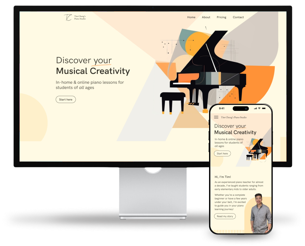
Build an attractive website for bringing in new piano students that provides all the information a prospective student would want to know - who I am, why they should join my studio, pricing plans, and how to reach out.

Helping students feel supported

Throughout my years of teaching experience, I’ve often asked my students and their parents how their experiences were when looking for a piano instructor. Some of the common threads I’ve observed are captured in this empathy map.

Providing everything to make an informed decision

I organized the site architecture into four simple pages with clear Call to Actions (CTAs). The homepage consists of concise synopses with CTAs to read more on other pages. The About and Pricing pages each have a CTA to fill out a contact form. 
The site is designed to funnel users through different levels of information, building up comfortability and enthusiasm along the way before ultimately landing on the Contact page.

Polished, friendly, and inspiring

Reflections

Organize the information I want to impart into a story. I have to be prepared for a user to land on any page and be able to naturally find their way around the site through digestible snippets and strategically placed CTAs.
The use of a motif can tie a site together nicely. I struggled to find a way to incorporate my personality but experimented with varying geometric shapes and music symbols until I found a balance that I was pleased with. The final design was far from what I originally envisioned but it came together through many iterations.

MORE PROJECTS

Crown Boutique

This bespoke design for a boutique showcases a variety of jewelry and dynamically highlights it through eye-catching imagery and typographic effects. The scattered layout sparks curiosity and creates an engaging way for viewers to browse the different collections that the boutique has to offer.
Crown Boutique homepage design

Neighborly

This design for a social networking app inspires people to seek community through its playful depictions of groups and events that cater to a wide array of interests. The cheerful color palette in tandem with the consistent yet diverse assortment of 3D illustrations instills that there is something fun for everybody, and finding friends can be just a click away. 
Neighborly homepage design

LoveNest

This design for a vacation rental company instills a sense of relaxation and curiosity through its refined layout, warm colors, and inviting imagery. The clean lines and whitespace give each element its proper attention and beckon the reader to explore all of the destinations at their leisure.
LoveNest homepage design

Defense Contract Audit Agency

This web application design for a government agency offers a clean and relaxed feel and an intuitive layout to a functional one-stop-shop for new and recurring visitors. Important and popular resources are prominently highlighted in floating widgets while subordinate links are strategically hidden behind a sidebar.
Defense Contract Audit Agency homepage design

NextWave Conference

This design for a tech conference evokes feelings of being relevant and modern while reflecting the cutting-edge and forward-looking values inherent in entrepreneurship. The cool color palette mixed with alluring gradients and the wave motifs scattered throughout evoke a dynamic quality to the design.
NextWave Conference homepage design

Kizuna

This design for a Japanese restaurant impresses upon their culinary excellence by highlighting the various dishes and maintaining that as the focal point. The elevated dining experience is further expressed by the mysterious yet elegant dark backgrounds along with the restaurant's unique interior setting and Hiragana characters as design motifs. 
Kizuna Japanese restaurant homepage design