[ OVERVIEW ]
Newly engaged couples often ask, “How much should we spend for our wedding?”
Creating a budget can be stressful, and online resources yield a wide range of advice that don’t always account for location, time of year, and couples’ preferences. Those one-size-fits-all percentages don’t cut it for such a highly personalized event.
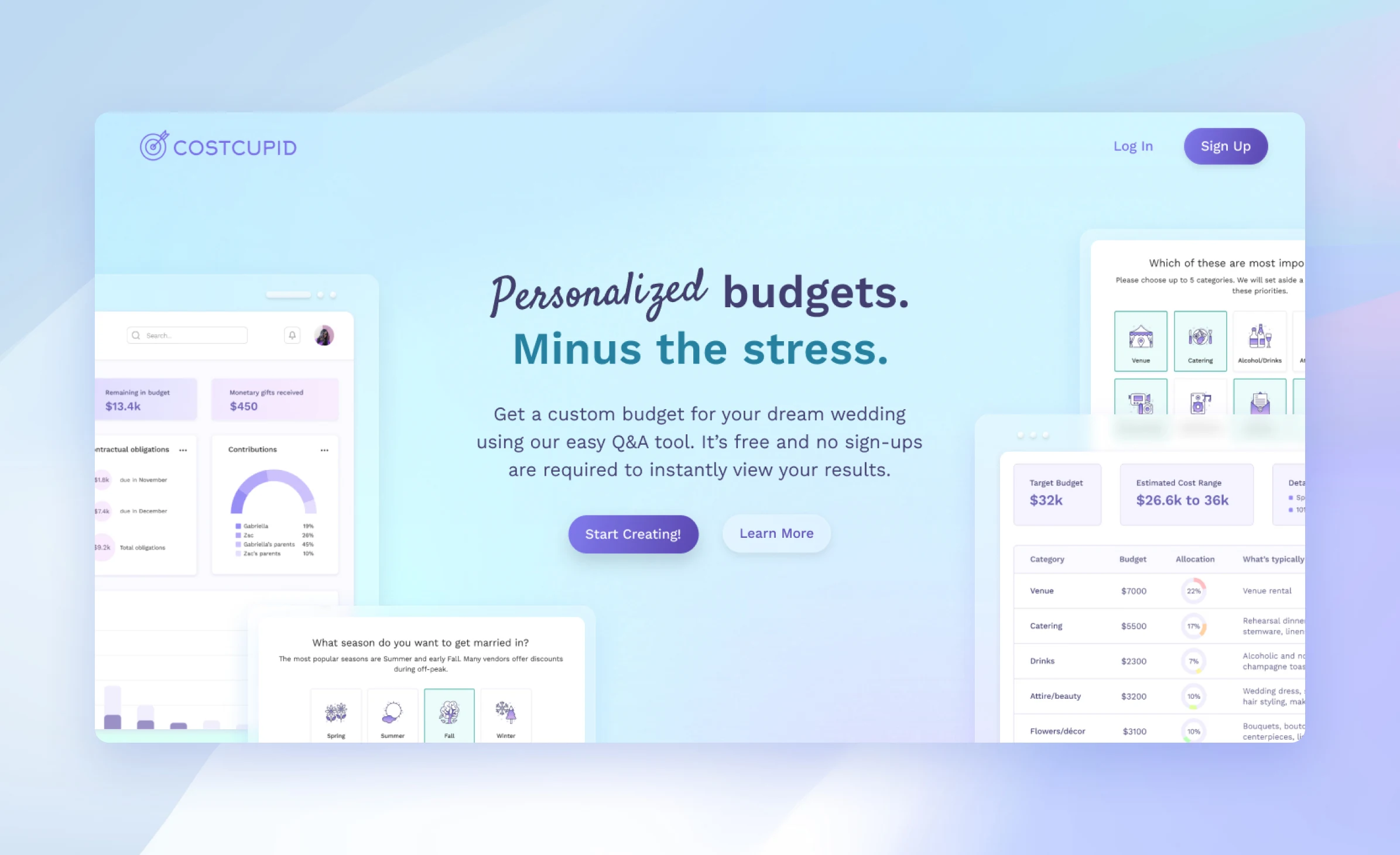
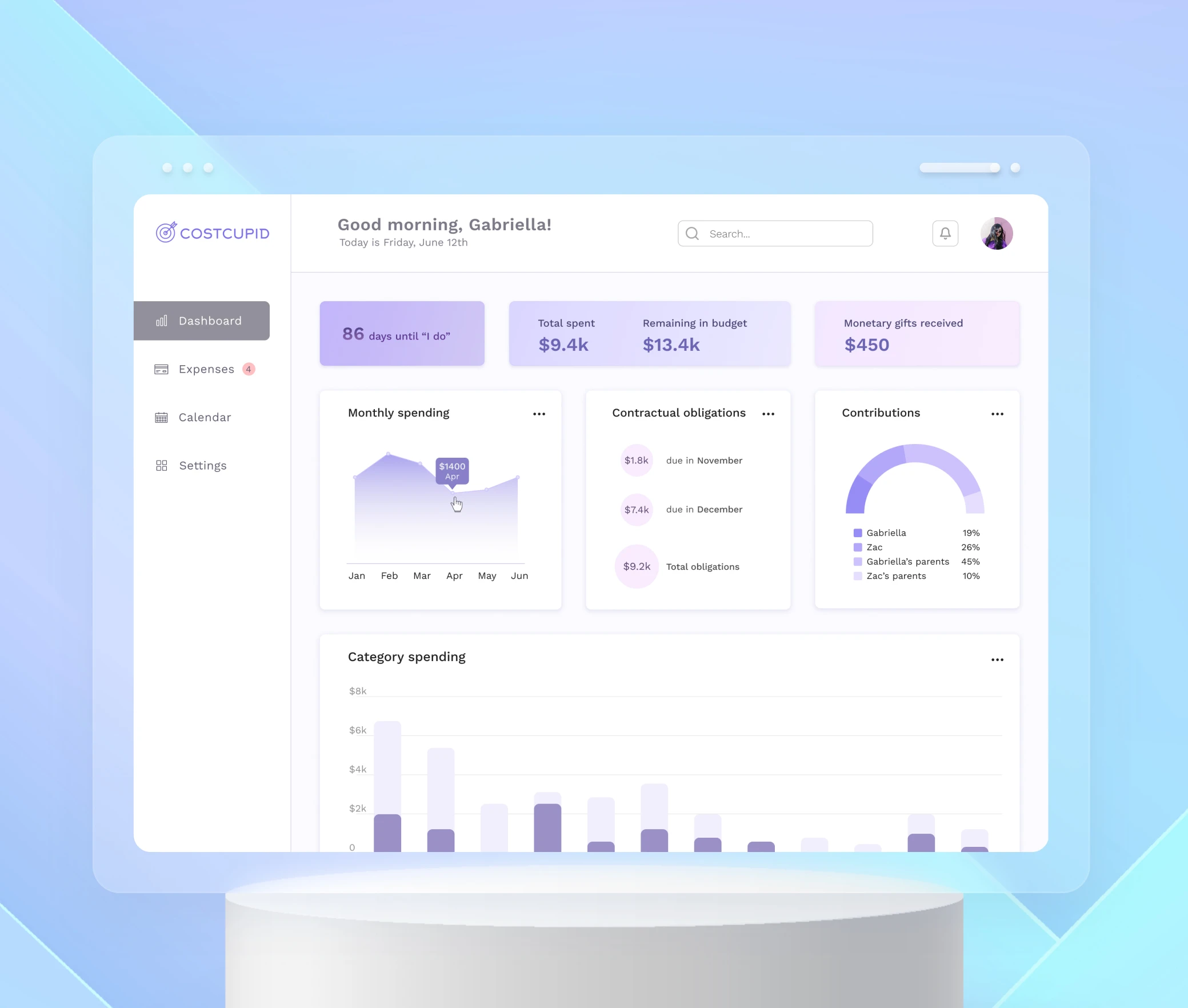
CostCupid is a simple budgeting tool that creates a custom budget by asking users a series of questions in a creative and engaging format. There’s an accompanying dashboard app that allows users to track expenses and contributions over time.
[ RESEARCH SURVEYS ]
Let's ask the married couples first.
In order to validate my assumptions about wedding budgeting, I created and distributed a short survey to 23 respondents.

A majority of respondents expressed feeling stressed from balancing all of the assorted costs as well as feeling pressure to spend more than they could afford. Many of them resorted to basic spreadsheets because existing tools had a learning curve and lacked customization. Finally, tracking vendor payment schedules was a sticking point for many tools.
[ COMPETITIVE ANALYSIS ]
Existing tools leave a lot on the table.
With this knowledge, I did a Google search and explored other popular budgeting tools that show up higher in the results since I assumed these would be the most widely used. I focused my analysis on customization options and ease-of-use.

Noticing certain trends, I discovered three ways that I could offer a better product:
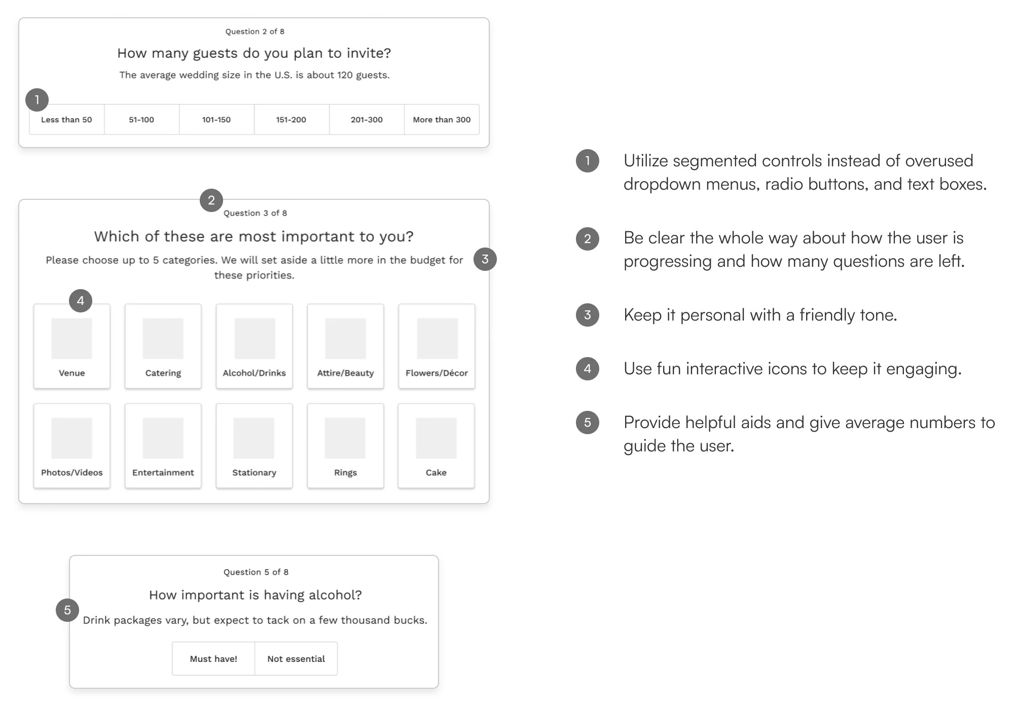
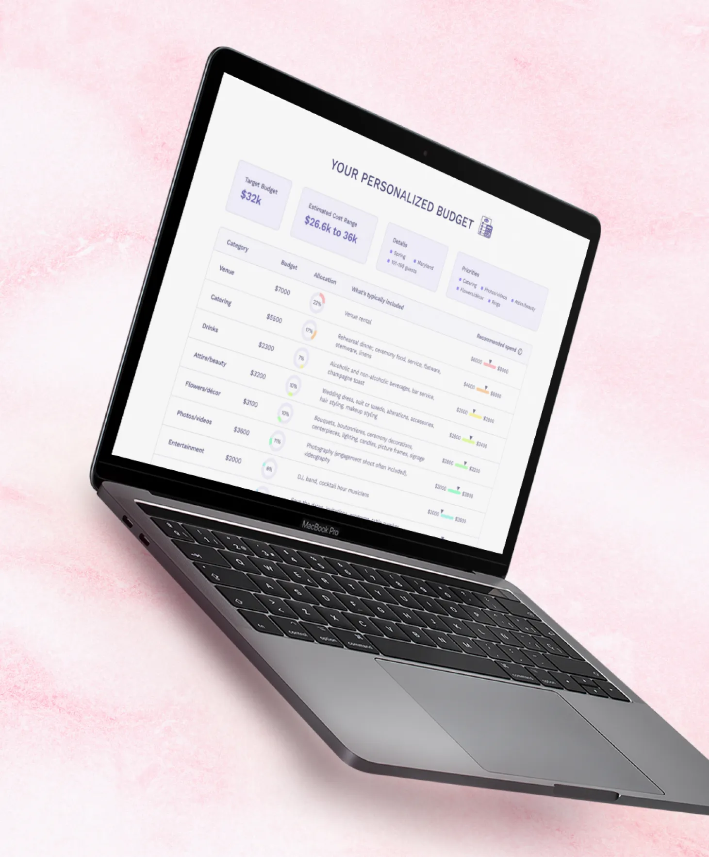
- Give clarity on how category allocations were calculated. Users need to feel like they're in control of the budget setting process, and there should be clarity about where their money will be going.
- Track contractual obligations and payment schedules. Keep track of all deposit and final payment schedules and provide reminder alerts.
- Provide a dashboard. Provide automatically-generated and intuitive charts that show visualizations of monthly spending, contributions, and category spending.
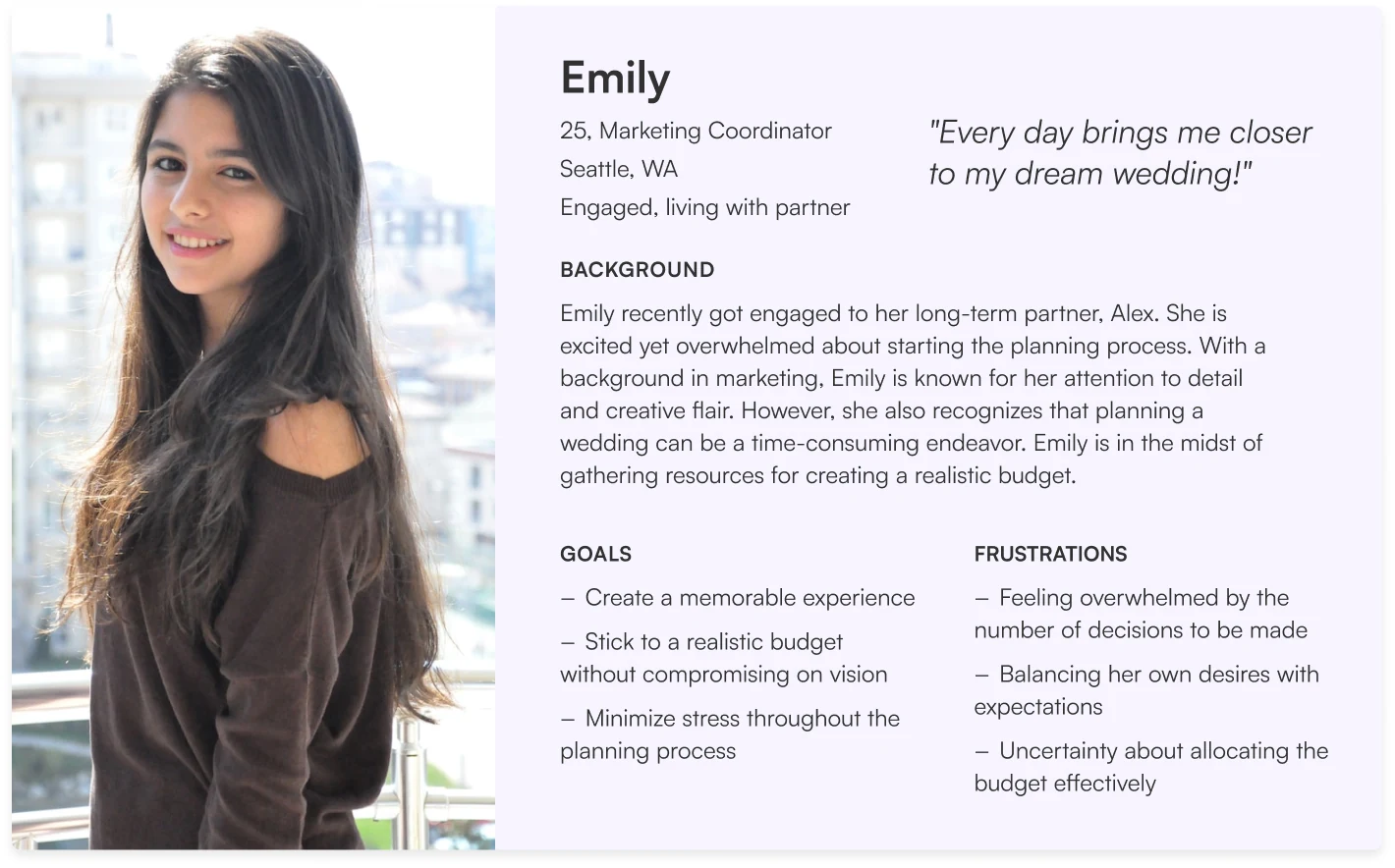
[ USER PERSONA ]
Designing for the organized but overwhelmed planner.
I consolidated the information I’d gathered from my surveys into a representative persona. She was used as a reference throughout the entire design life cycle to remain focused when making decisions.
[ INTERACTION DESIGN ]
Making budgeting feel like a fun quiz.
The challenge was to find a way to give the user a sense of control in creating their budget while keeping them engaged throughout. I opted for a gamification model through a series of eight questions that would be used to generate a personalized budget. It gives a “choose your own adventure” feel to the process.
[ DESIGN SYSTEM ]
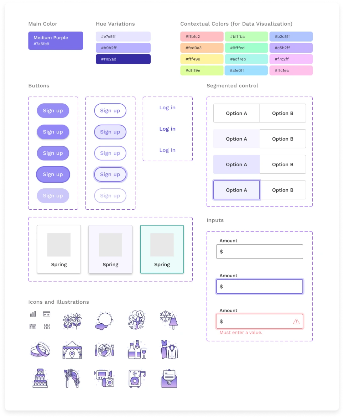
A design system built for playful clarity.
Reflected across the choice of color, buttons, form controls, iconography, and illustrations was a consistent set of brand values I strived to exhibit:
- Savvy – since the color blue is commonly used by financial institutions and perceived as trustworthy and stable, I elected for a more purplish hue to exude a more modern and electrifying feel
- Fun – expressed through the use of playful illustrations
- Contemporary – modern and clean feel through eye-popping gradients and crisp layouts
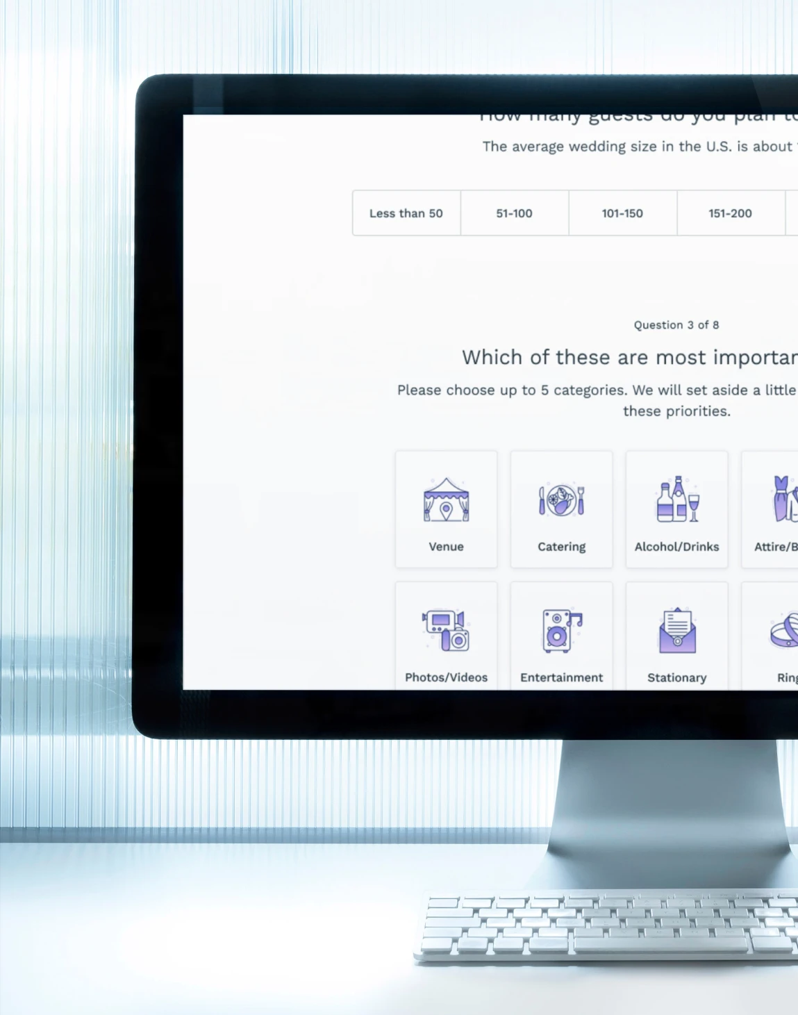
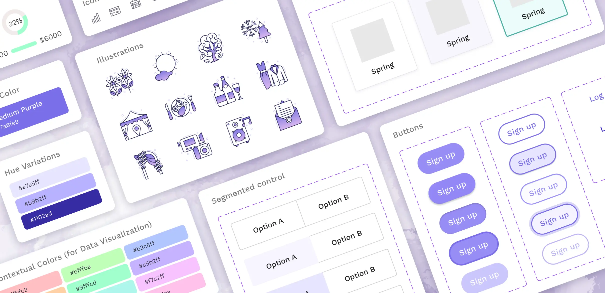
[ FINAL DESIGN ]

[ REFLECTIONS ]
Conducting surveys and identifying gaps in similar product offerings can yield new approaches.
Just because all of the main competitors do things one way doesn’t prohibit me from trying a different approach - in this case, electing for a more interactive budget creation process and adding on a more visually striking dashboard.
Establish a brand identity early.
Even though I ended up tweaking the UI style kit many times throughout the design process, the core brand identity - to be savvy, fun, and contemporary - was a constant pillar from the onset.
The next step is to conduct more usability testing and get feedback on users’ thought processes as they’re answering questions. Moreover, I’d like to build out the other pages in the dashboard and seek input on how to make the most effective visuals.